Vanishing Points
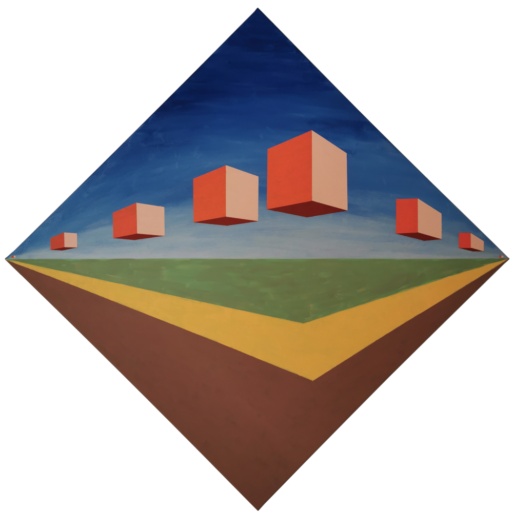
[Acrylic painting on canvas 80 x 80 cm, 2020]
The Idea
During the trip to a painting course at the Kunstakademie Allgäu “Innen- und Außenwelt” by Sid Gastl I thought about strongly abstracted picture ideas concerning clouds and landscape. This time the scene was not to be constructed on the computer (as is typical for me), but could be easily sketched on draft paper.
I had the idea to turn the square canvas I brought along by 45° and to develop a diamond-shaped motif. The first realization was that the right and left corner plays a special role in perception. The motif has to adjust to this. Its visual content should be intensified and not hindered. For the original theme this means that the horizon line must run through the corners. As a result, it quickly became clear that the corners must also be identical with the two vanishing points. As an added bonus, the concept means that all screen edges are automatically perceived as part of an escape movement. The image will later be “in a state of movement” as a result. Without this assignment, the edge of the screen would be perceived as an arbitrary frame rather than as part of the image.
Image layout
With these conditions it was predetermined that the lower half of the image belonged to the ground, and the upper half to the sky. This initially results in a relatively boring separation of the image into two halves.
Trajectories
In the first design, created in Mind, a series of clouds should “fly” from the vanishing point on the left to the front and then move away to the corner point on the right. The clouds were to be represented in a cube-shaped abstract. In reality these clouds would rather describe a curved path. To the canvas format again an edged trajectory would suit better. I selected a line coming from the left, bending sharply to the right by 90° to reach the second vanishing point. In order to give the picture a sense of tension, I moved the curve point from the middle to the right. After defining the position and size of the front cube I chose the remaining cube positions in a way that would give the impression that the cubes are braking at the turning point. Otherwise the turn point would remain implausible.
Clouds
Originally, the clouds were to be realized in glazed white/grey on a blue sky background. However, the question arose how a cloud that tends to be cubic can be represented in an acceptable way. Such an overpainting easily gets an orientation that does not show a satisfying volume any longer. In this situation I discussed with the instructor and got the suggestion to not " naturalistically” represent the clouds in the already highly abstract structure, but to even further abstract them. This raised the question of how the now “solid” cubes should be colored. I browsed the internet for cloud images with extreme color atmosphere and found one that showed a sunset with clouds illuminated flat from the right side with a color trinity “beige-orange on the right, orange-red on the left, dark red at the bottom” in front of a horizon “dark blue on top, white-grey at the base”. I copied this color set 1:1 for my cloud cubes.
See the paper draft with the first colors:
Sky
I made the sky arc-shaped with the two colors taken from the photo. To achieve a smooth color transition I mixed another blend paint for the medium high zone. All three colors were done wet-on-wet. The gradient was later overpainted with the grey-white again because it was too dark at the bottom.
Ground
To further improve the three-dimensional effect, I drew a projection of the trajectory on the ground exactly “under” the cubes as a “flowering field”. For the color scheme I found again corresponding field and meadow photos as a reference. The chosen green was matching the color scheme from the beginning. The first yellow was too cold and had to be warmed up with red to match the sunset. The greenish-brown field in the foreground didn’t match the color mood either and was also reworked with red.
Shadows
To further enhance the perspective effect, I could have constructed a shadow on the floor for each cube. But that also would have reduced the abstract effect. In addition, the shadows would have to appear relatively far in the background, since the sun is standing very flat.
Implementation
If I had followed my original intention, I would have painted the color areas completely uniformly, or according to Sid Gastl, “painted” them. After some discussion I decided to leave the brushstrokes clearly visible. The result really looks more expressive.
Thank you very much!
especially to Sid Gastl for his openness and the many helpful and inspiring suggestions. I had a lot of fun, especially during the discussions about art and physics!
the participants of the course for discussions, encouraging and much more
the Kunstakademie Allgäu for the great organization, especially so shortly before the next lockdown…